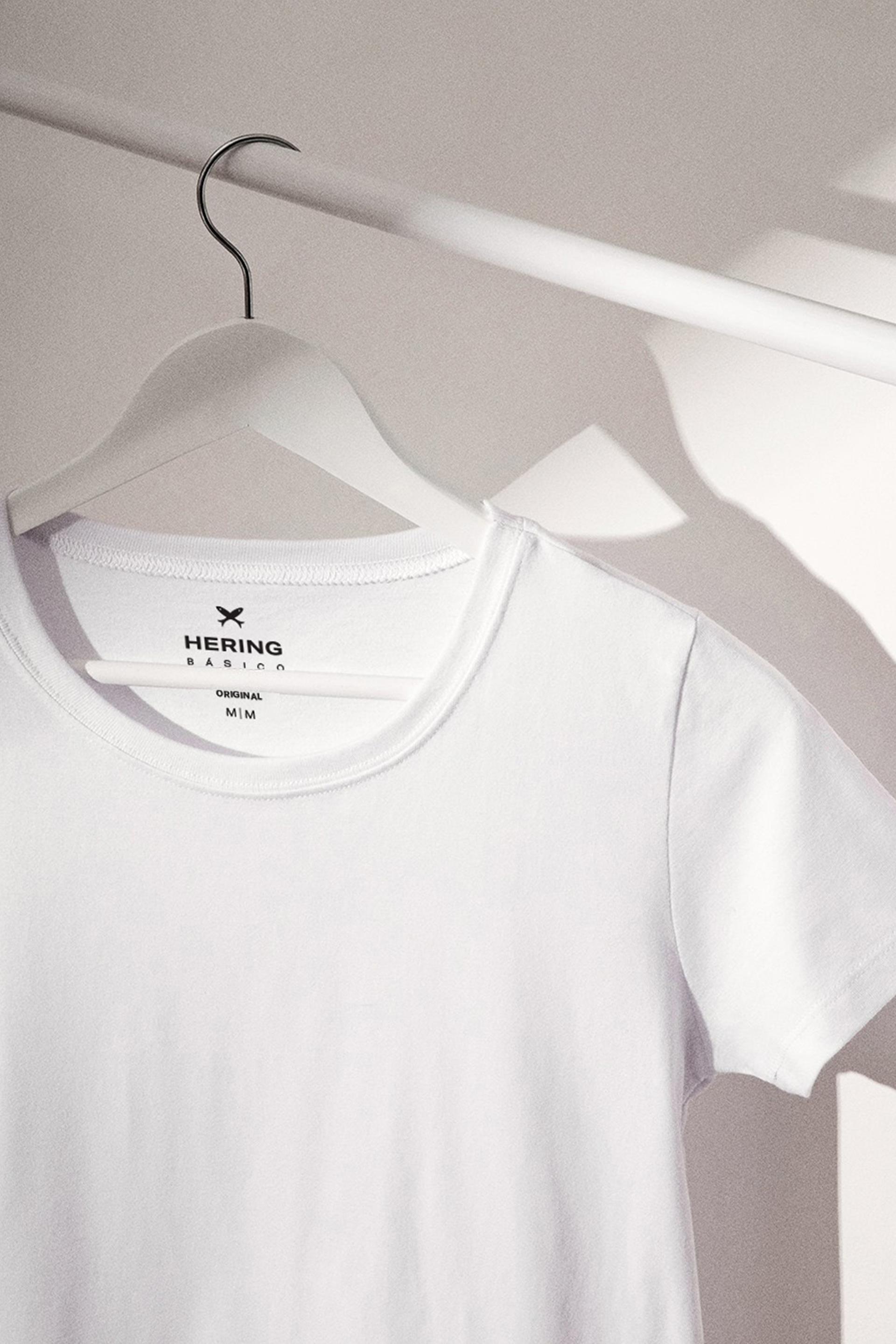
Visual identity for one of the biggest fashion retailers in Brazil. Hering was founded in 1878 by Bruno and Hermann Hering in Blumenau, Brazil. The company became a reference for basic and high-quality T-shirts.
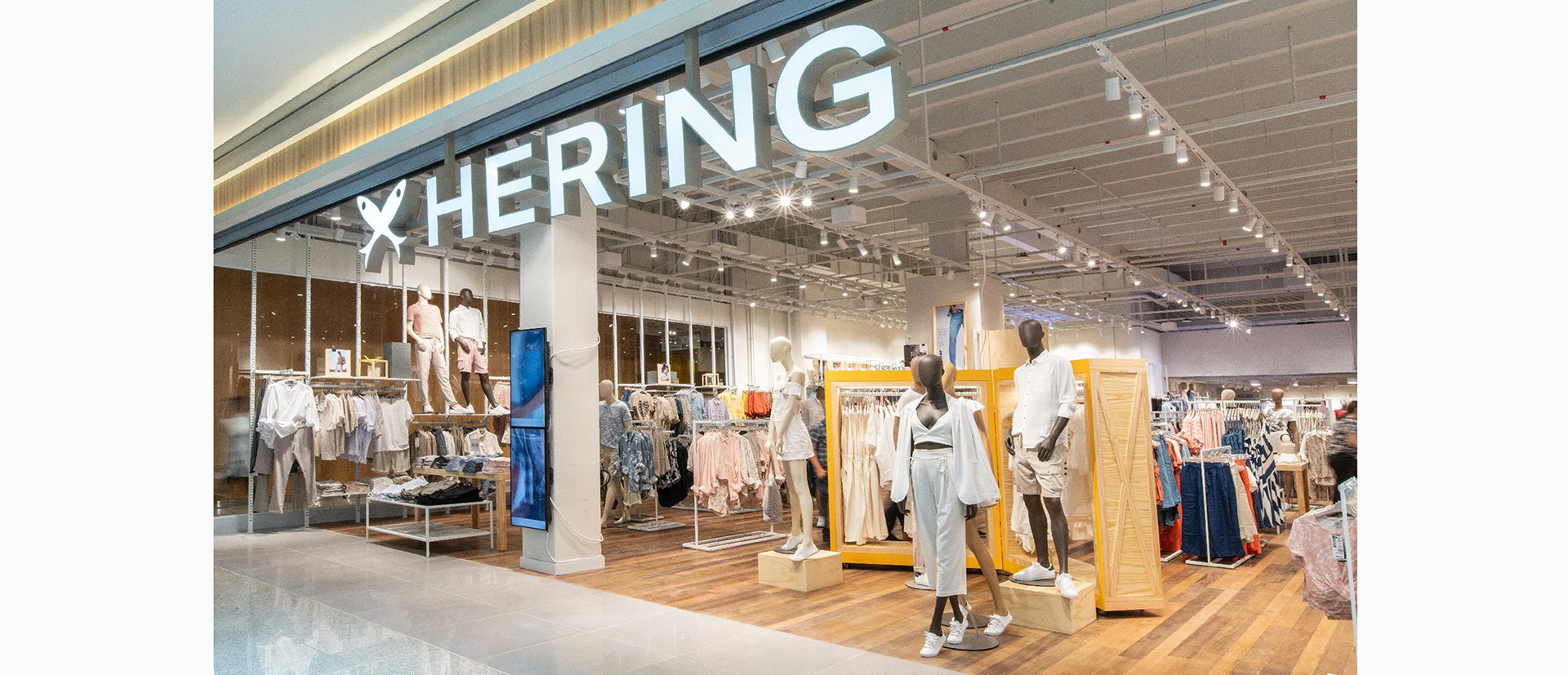
The ALMAP design team worked closely with the Hering marketing team to create a new visual identity that builds on the company's incredible heritage to position it for the future while always looking back on its 140-year history.
hering.com.br @hering_oficial
The ALMAP design team worked closely with the Hering marketing team to create a new visual identity that builds on the company's incredible heritage to position it for the future while always looking back on its 140-year history.
hering.com.br @hering_oficial

INSPIRATION
As part of our research, we visited Hering's headquarters in Blumenau, including the Hering Museum, where we knew the history of this celebrated company.
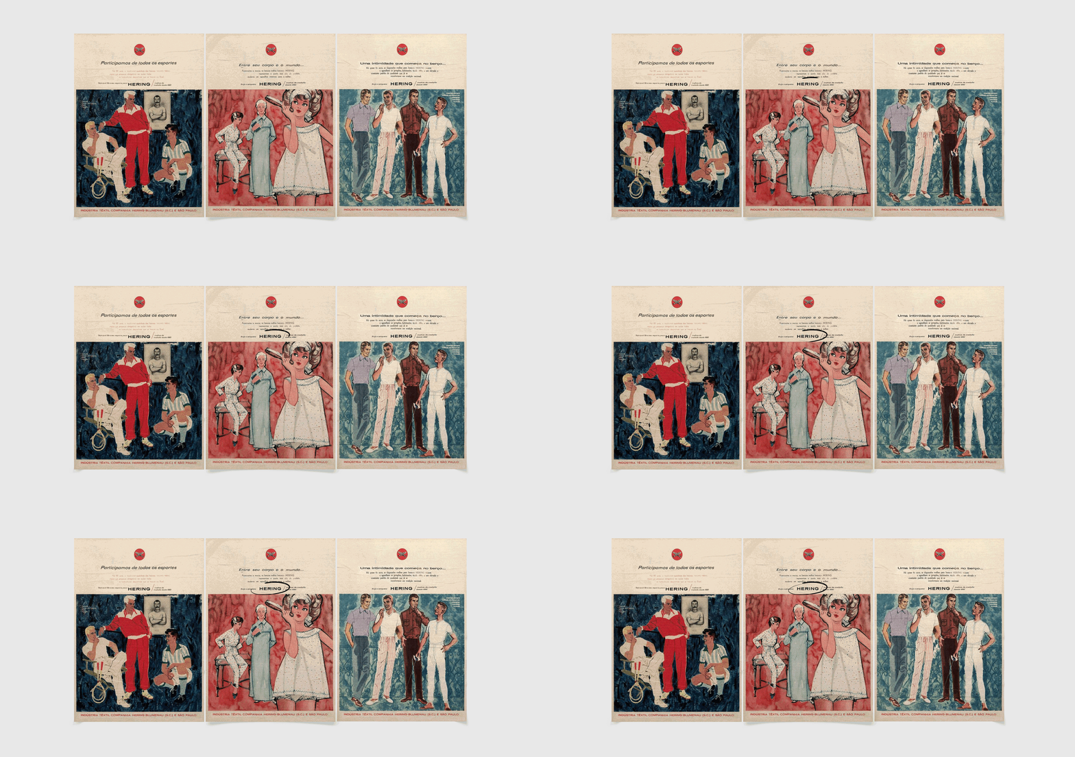
We identified that in some ads from the 50's, the logo had a lettering in all caps, which was balanced and impactful. In addition, the Hering icon was present in the communication but not necessarily linked to the lettering.
We identified that in some ads from the 50's, the logo had a lettering in all caps, which was balanced and impactful. In addition, the Hering icon was present in the communication but not necessarily linked to the lettering.
LOGO
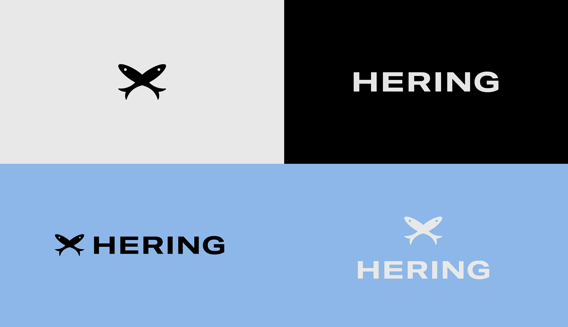
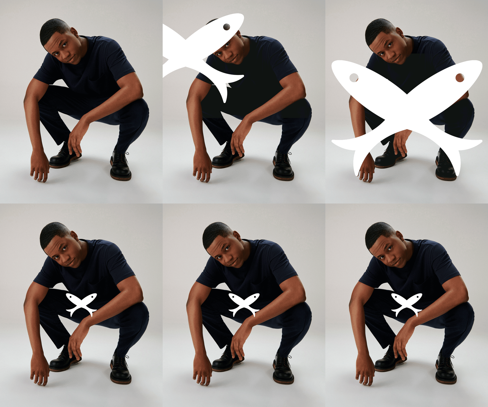
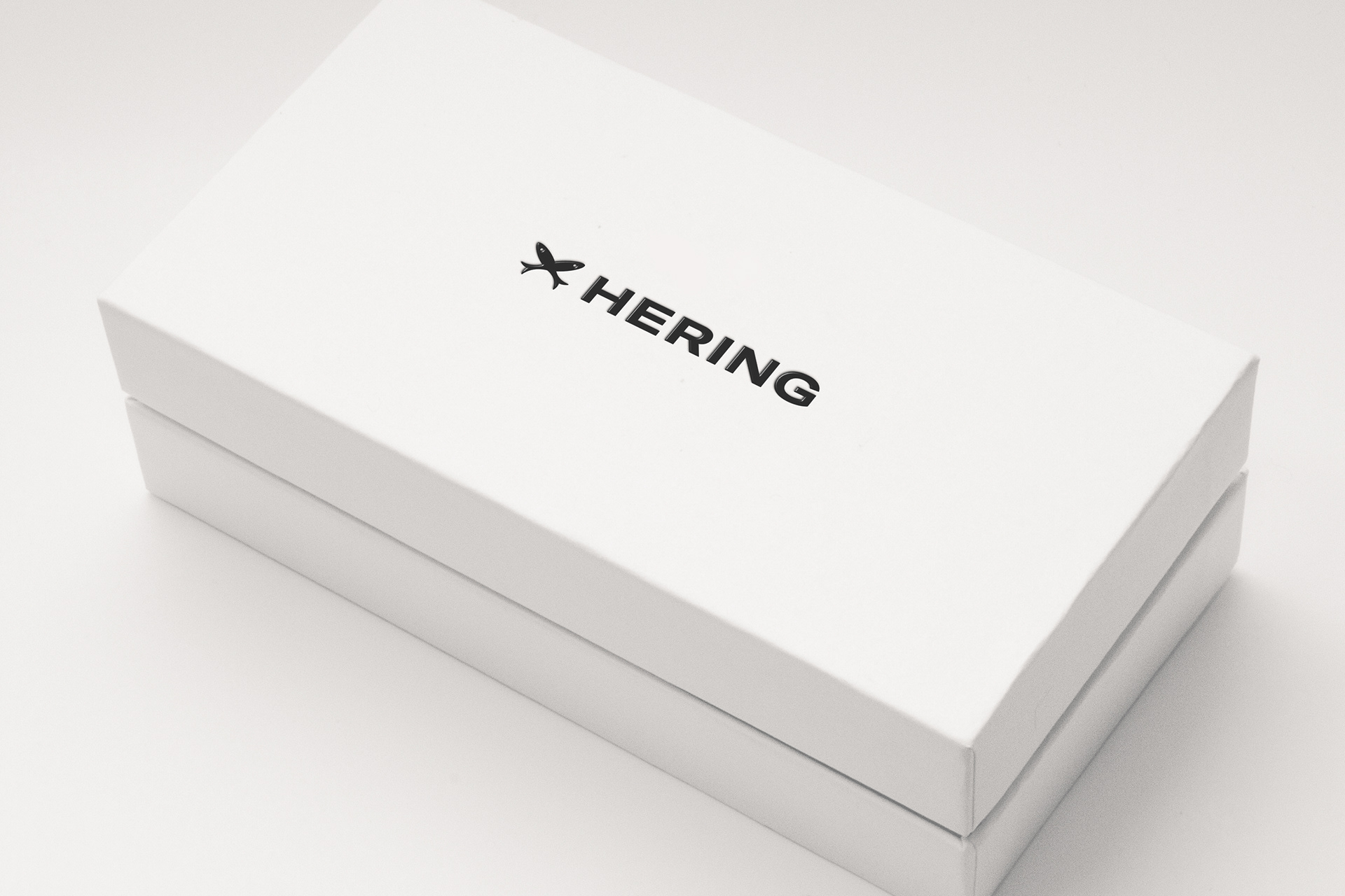
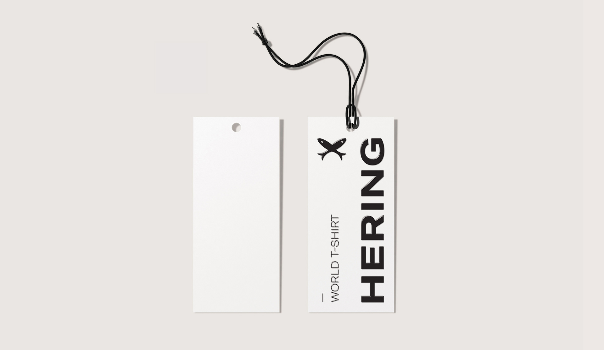
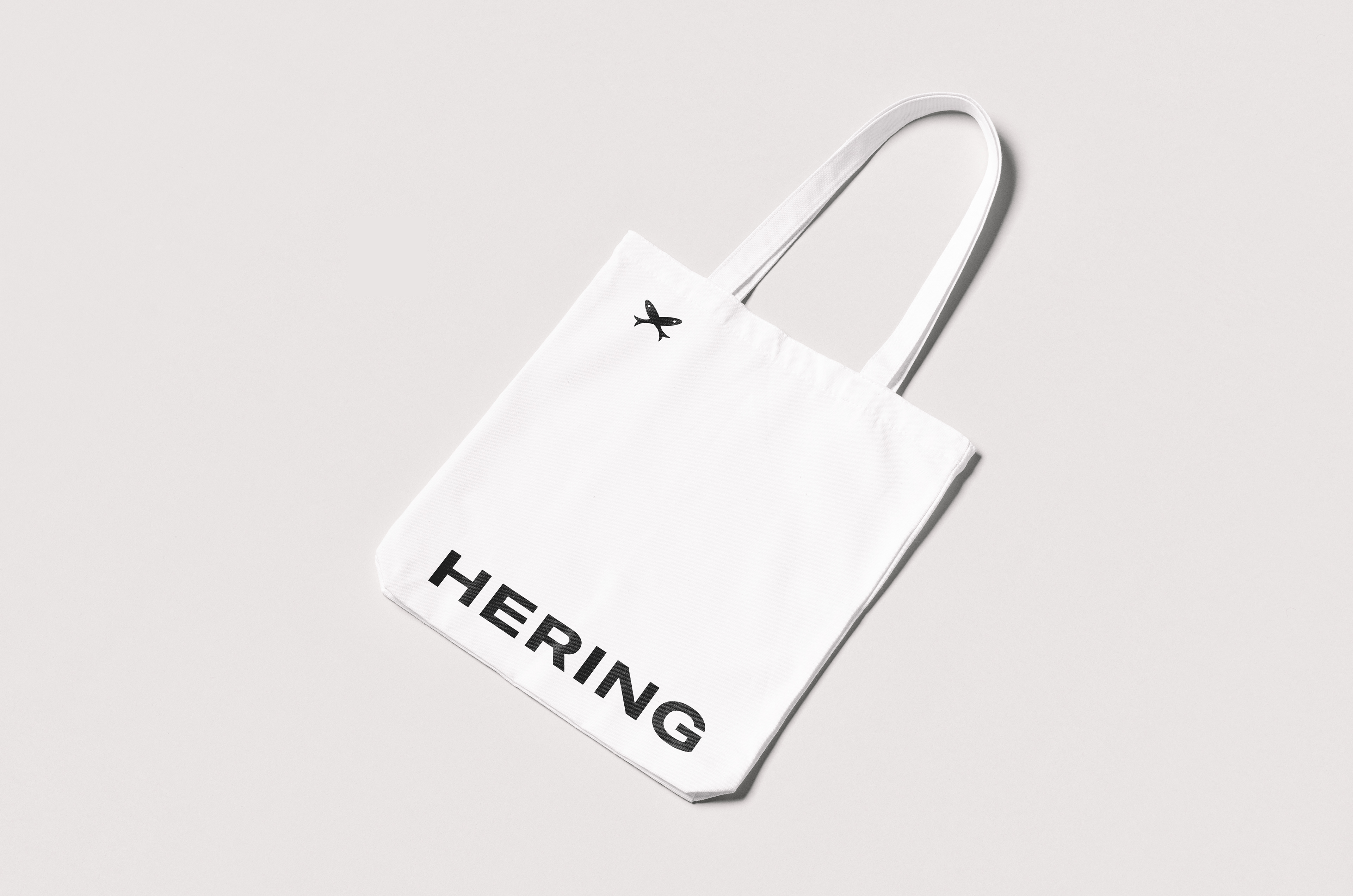
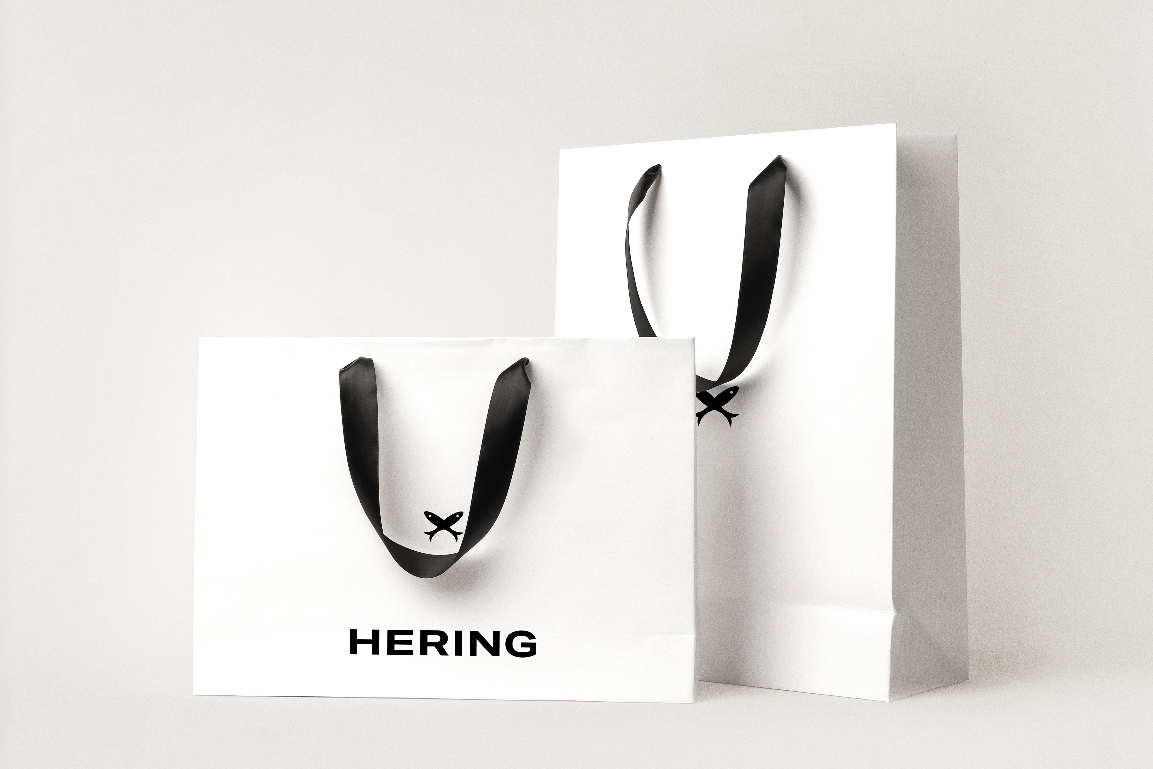
Hering is a German word for herring. For this reason, the company's icon is made up of two fish, which represent the two founders. They've had their design fully preserved in this project.
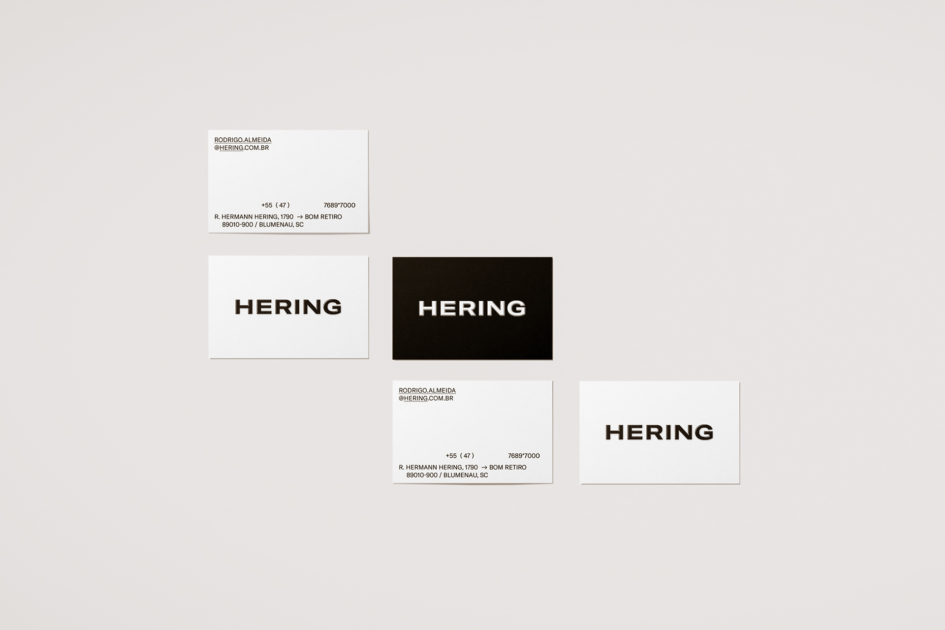
Based on our inspiration, Hering's lettering was upgraded to uppercase and went through a series of adjustments that preserved its peculiarities while making it more modern. Icon and lettering can coexist and become the basis of a versatile design system.
Based on our inspiration, Hering's lettering was upgraded to uppercase and went through a series of adjustments that preserved its peculiarities while making it more modern. Icon and lettering can coexist and become the basis of a versatile design system.
COLOR PALETTE
In the fashion environment, every year, new colors are developed and combined in countless ways. This versatility demands certain neutrality from the brand's basic color palette, one that adapts easily to any combination that may arise.
In the fashion environment, every year, new colors are developed and combined in countless ways. This versatility demands certain neutrality from the brand's basic color palette, one that adapts easily to any combination that may arise.

TYPOGRAPHY
Hering's typography is adapted from the GT America font developed by the Grilli Type studio. There are three different families with six weights each.
Hering's typography is adapted from the GT America font developed by the Grilli Type studio. There are three different families with six weights each.

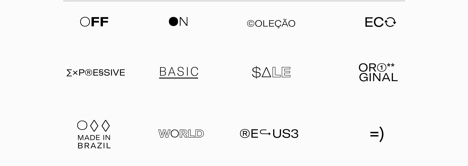
The Hering icon is part of the GT Hering typography glyphs, in addition to having other special characters that can help to create various graphic materials.

HOW DOES IT WORK?
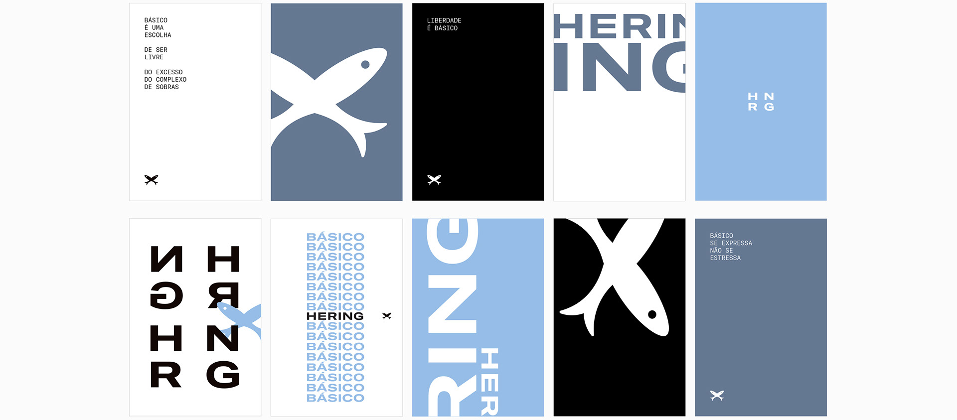
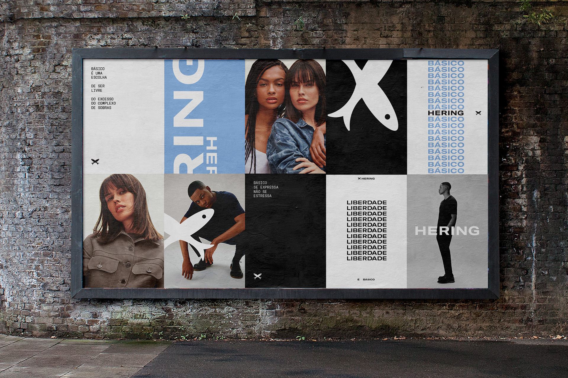
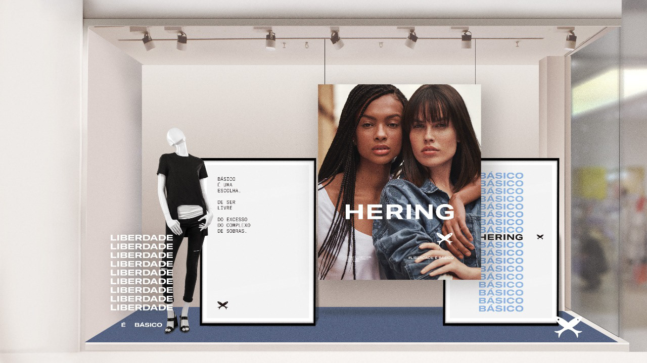
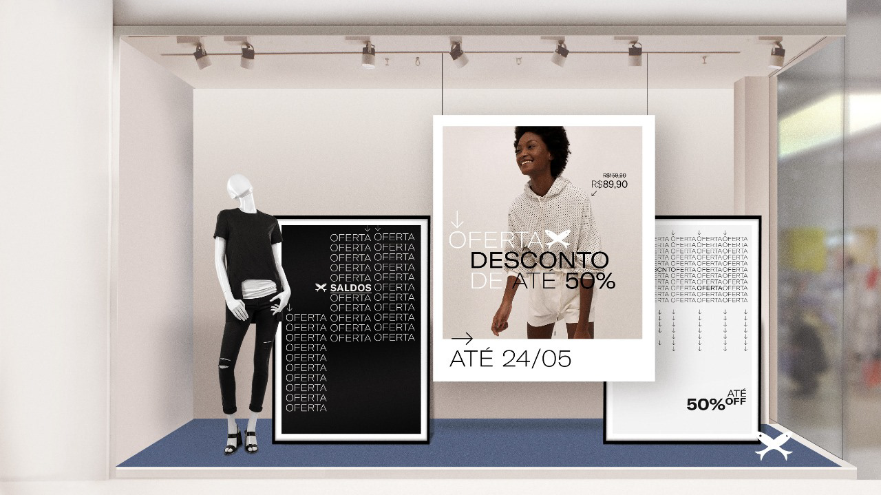
The basic ingredients combine in different proportions for Hering's visual modules.
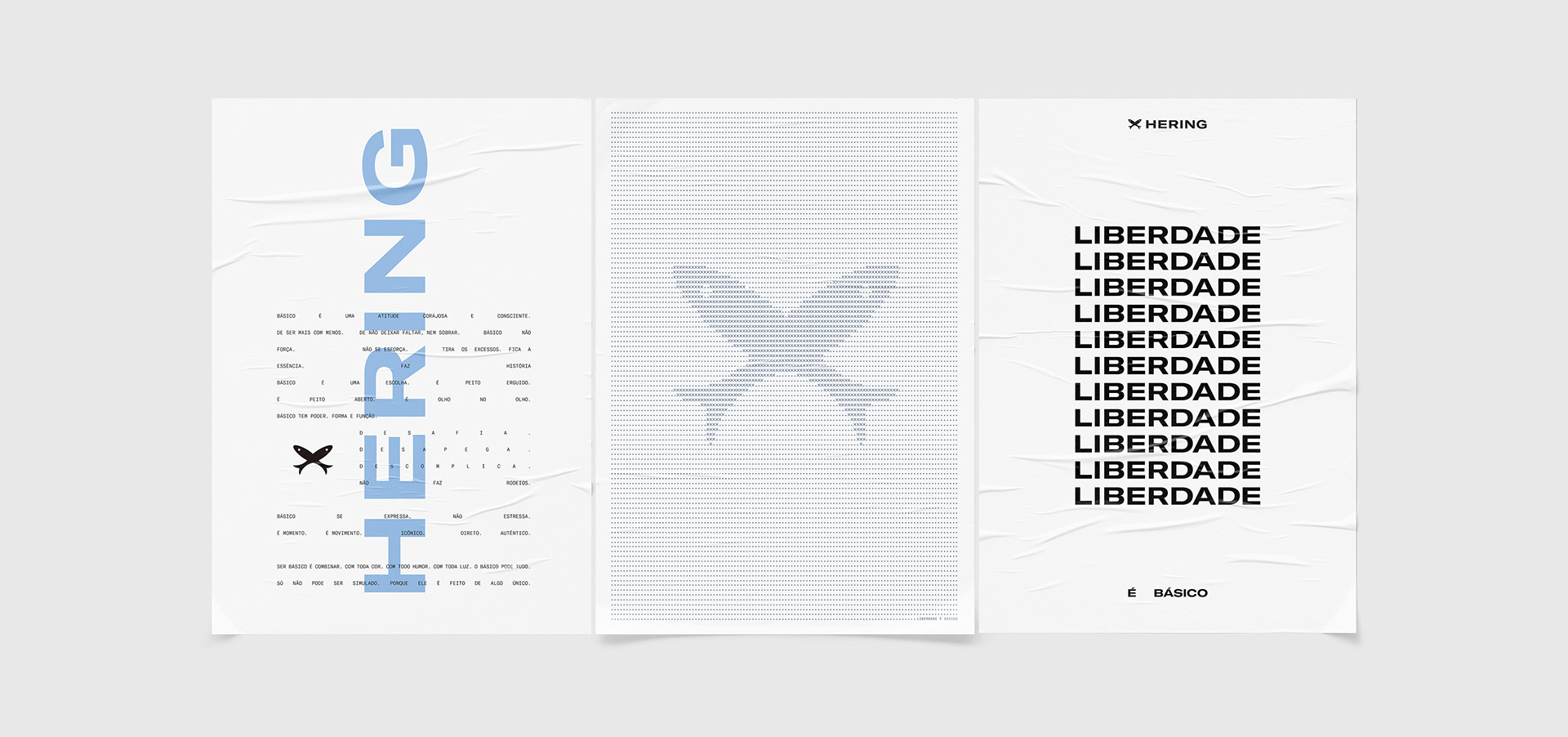
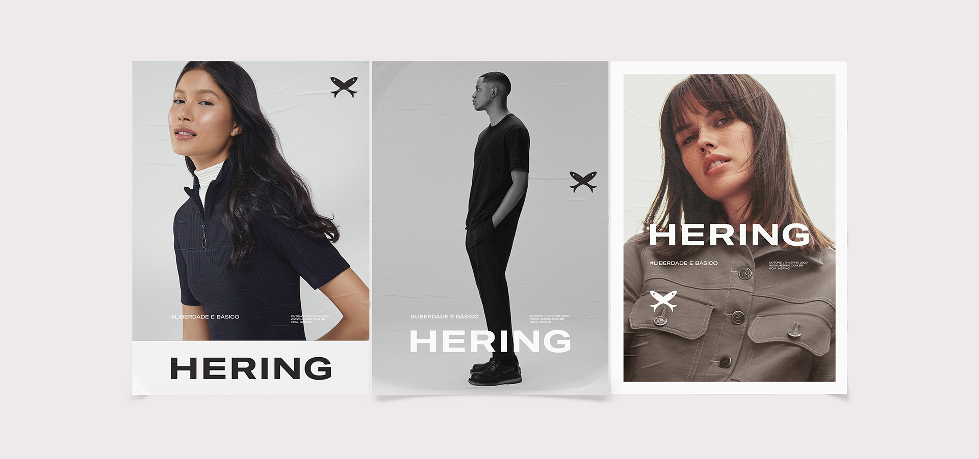
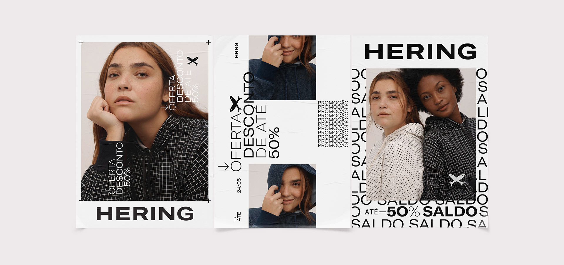
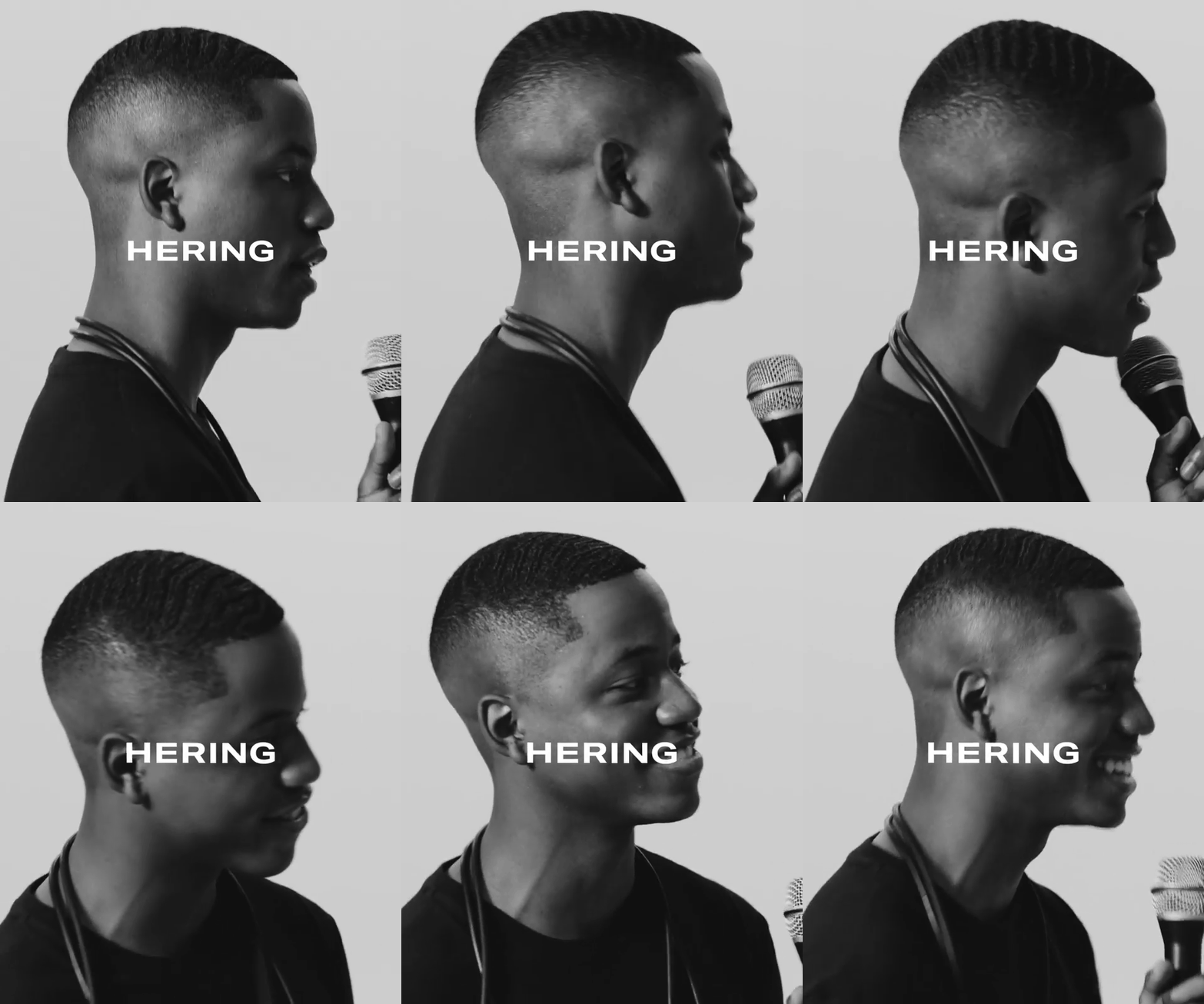
Aiming to give a punch to the brand and reinforce the concept of the basics, we developed a versatile, minimalistic, and balanced design system.
Aiming to give a punch to the brand and reinforce the concept of the basics, we developed a versatile, minimalistic, and balanced design system.


DC: André Gola, Marcus Sulzbacher, Marco Giannelli
DA: Antonio Belchior Neto, Fábio Girardi, Paulo Altieri
CW: Fernando Andreazi
Agency: Almap BBDO
DA: Antonio Belchior Neto, Fábio Girardi, Paulo Altieri
CW: Fernando Andreazi
Agency: Almap BBDO


